The challenge
As a design coordinator, I looked for ways to reach more gamers and subscribers in Latin America for this Tencent subsidiary in order to increase sales
At that time, Level Up already covered Brazil and the Philippines but it was necessary to expand horizons and thus reach new audiences in Latin America, which understand video games in a different way beyond the language barrier.
Our challenges:
- Tailor the site for the region
- Increase the number of users
- Consolidate the conversion funnel
- Change the purchase model
- Improve website positioning
My role
The characteristics of this position were very varied, as coordinator I had to take responsibility for myself and the entire team both Visual Design and UX. Likewise, I worked hand in hand with SEO and Social Media team for the optimization of positioning and at the same time support the IT area through contributions as front-end development and user flow modeling.
Design Process
Free games for the masses
This process begins by understanding the purpose and business model, which is not very common in Latin America, so we began by identifying the variety of stakeholders in the sector from gamers to "cafe internets" or entertainment rooms that we would later structure as channels B2B.
Simultaneously, we conducted a competitive analysis with the purpose of internalizing the buying behavior of young people and children who play or have played games online, in order to enter in a forceful and efficient way in an environment monopolized in the region by Riot and Blizzard.
Research
By clearly identifying the stakeholders, we conduct online and face-to-face hybrid workshops due to the users' skills. We recruit different profiles as children who play cell phone games to esports teams to validate with them the basic needs required on the website in terms of information or eCommerce.
Through these focus groups we carry out card sortings, surveys, analysis of core, current and augmented services. Likewise, the first approximations of design sketches were made by the users, providing useful information regarding distributions, forms and structures that we would later study and use.
Deliverables: Brainstorming photos, competitive analysis, survey reports, workshop results, the core service analysis, the actual service analysis, the augmented service analysis, storyboards, sketches.
Definition
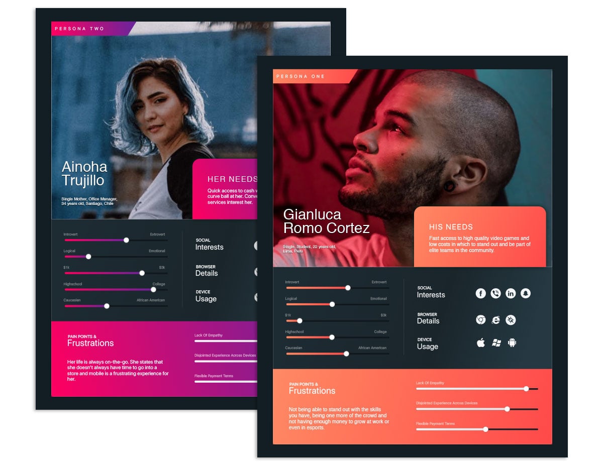
When analyzing all the information previously collected, we profile B2C and B2B users for the process of buying and acquiring information. Each profile was developed as a user persona and based on that character, we evaluate scenarios, moments and responsibilities in each of the nodes within the customer journey.
We resumed the sketches made by the stakeholders, we validate and adjust them to define the users flow and screens flow. At the same time we verify the labeling and the site map with the purpose of offering a light, easy and simple experience.
Deliverables: Screen flows, sitemaps, user personas, journey maps, information architecture.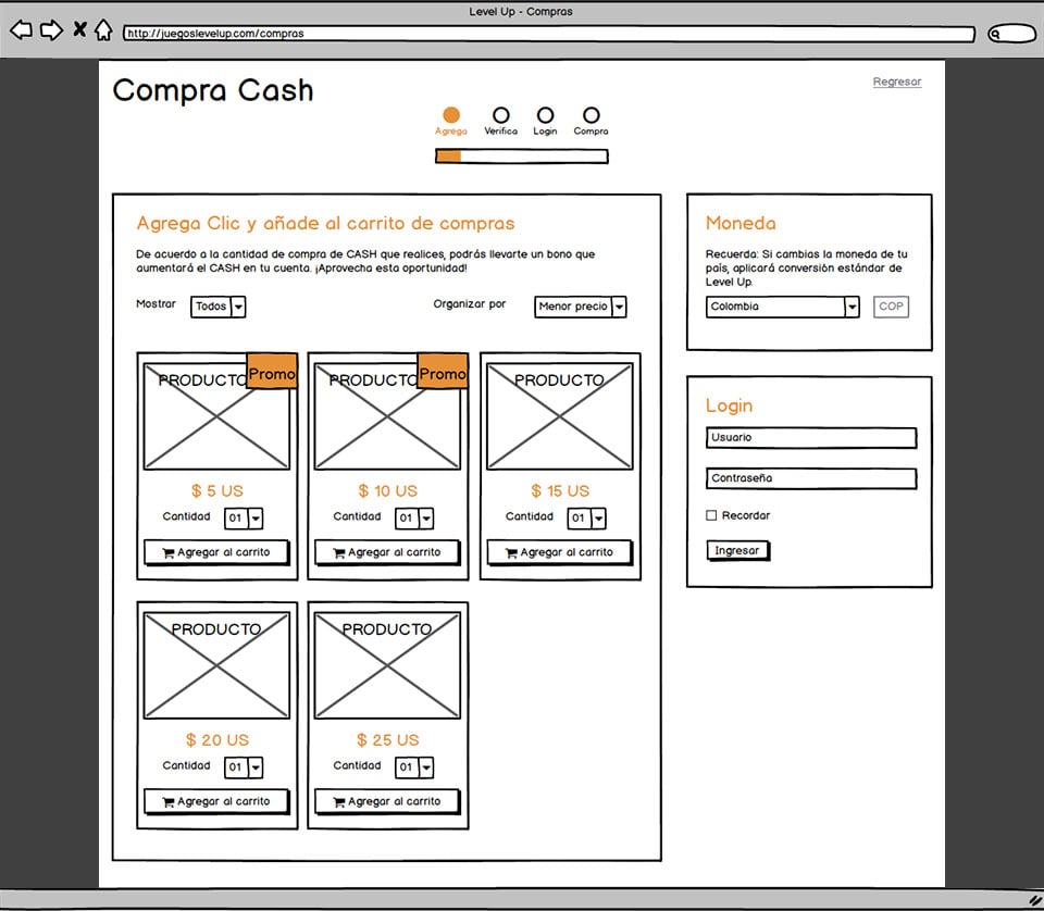
Prototype
After organizing the documentation, we made sketches in the real size of the devices that we would use in the WOZ prototype. After iterating twice, we define the content and structure required, so we finally make digital wireframe artboards linked together to consolidate interactive prototypes that could be tested on desktop, tablets and cell phones respectively.
Deliverables: Sketches, wireframes, low-fidelity design, interactive prototypes, WOZ mockups.
Design
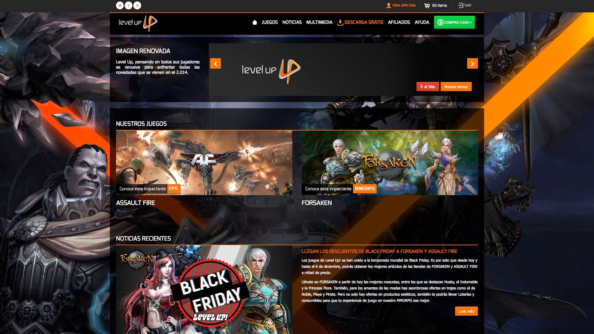
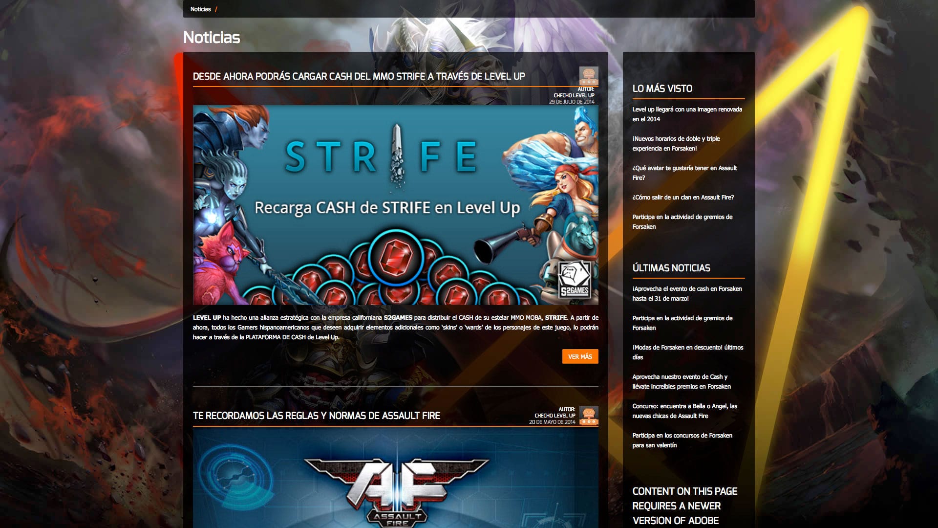
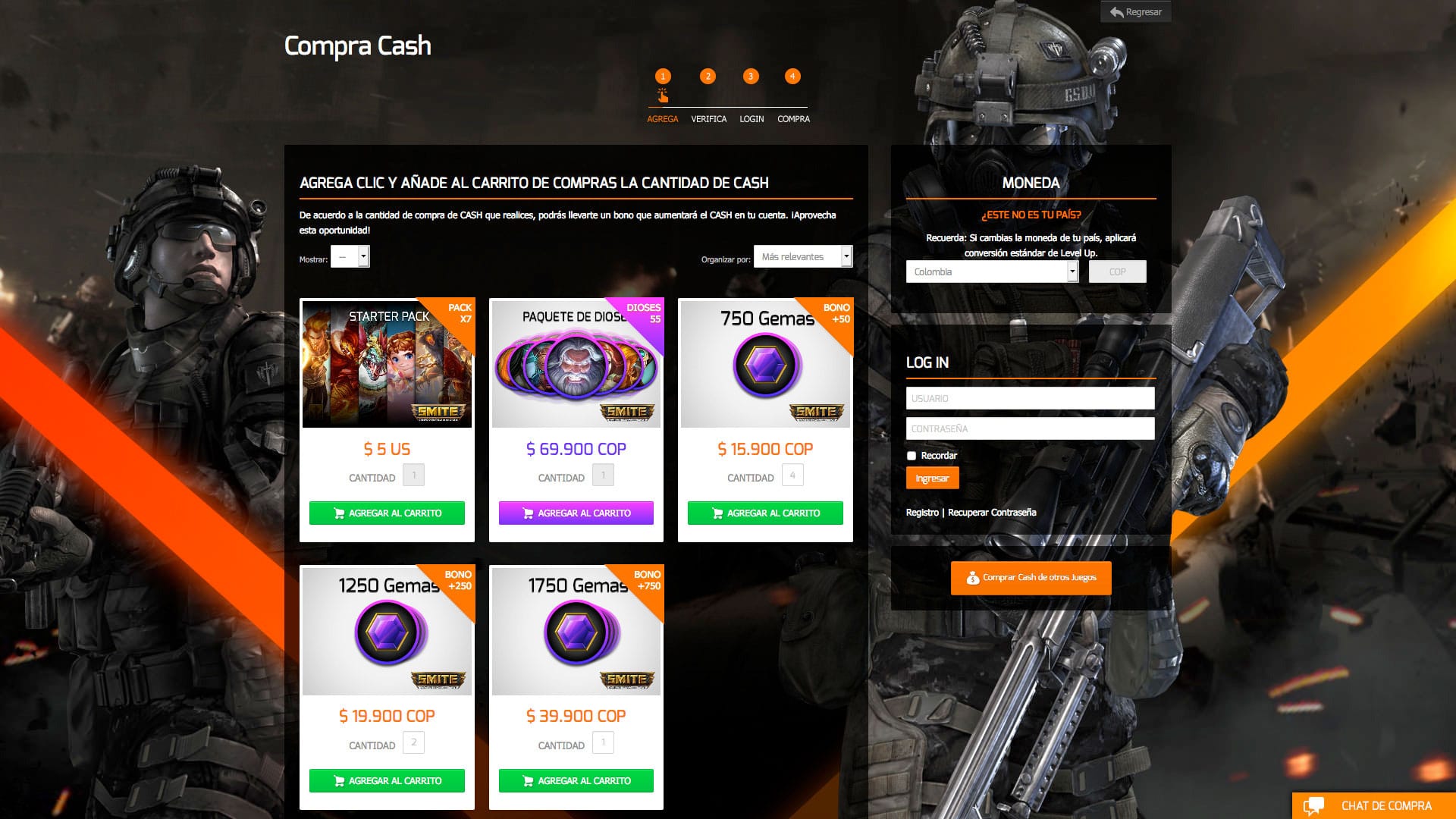
Looking at multiple references, we found characteristic features focused on this audience with saturated colors, brightness, dark backgrounds and overloaded images. In this way, we adopt these attributes to our design line and include them in the fluid design system of Level Up. We consolidate these aesthetics and distribution as a differential because at this time the developers and licensors of video games preferred to have several web page versions than to have only one that could be adapted to multiple devices.
Deliverables: High-fidelity design, interactive prototypes, style guides.

Front-End
The coding was divided into repeated sections using includes and variables. In the same way, each of the possible screen flows was programmed so that at the time of testing users, random tasks could be assigned within a bank of options and not require the loading of several models.
Based on the Zurb Foundation framework and adding Bootstrap features, the concept of liquid and adaptable design was reinforced without having to set aside the saturation of objects, sources and images simultaneously.
Deliverables: Style guide, Php, JS, Jquery, Less, images.
Test & Measure
All stages of the process were validated with B2B and B2C stakeholders because we wanted to offer a user-centered digital product and simultaneously validated by labeling, accessibility and positioning control tools.
Prior to publishing the page, we did alpha and beta version tests with real users to optimize the website through A / B testing, scroll maps and heatmaps.
After publication, all the information continued to be analyzed thanks to the data of millions of users optimizing the website and modifying it to provide the best conversion funnel.
Deliverables: Task flows results, accessibility results, heatmaps, scrollmaps, clickmaps, A/B tests results, WOZ video recordings.
Results
73
Surveys
164
Usability Tests
41
Iterations
540
Artboards
Learnings
When working with niche audiences, the best way to provide useful products is to first face the needs and frustrations of users because they usually have the answers how to solve what they do not find in the general market.
Today we can find many usability studies and we tend to fall into the error of believing that if some patterns are useful in other or similar business models they will be useful in the same way in our cases. Level Up is a vivid example that this is not the case, through our investigation we found that pages with clear backgrounds and buttons of a single flat color were more visited and better interpreted by users, but in this case, it was not, clean design, simplicity and minimalism were despised by our final users because they were considering it a general stadard and the last thing this target wants is to be equal to the common people, so their tastes are much more baroque, saturated and dark.
As the company grew in sales and recognition, the behavior was evolving towards other flows of screens and purchases, so registering data from as many users as possible became a need to continue growing together with the community, their tastes and their new acquired skills.