The Challenge
Rockwell is a brand recognized worldwide for its suite of machine and factory automation applications, but decided to unify them in one, Factory Talk.
Each application was intended for a specific action and each one was positioned in its particular niche, the objective was to make Factory Talk a leading application in each and every one of these niches, improving the usability and transversality of the content or tasks that need to be assigned to the production machines.
Our challenges:
- Improve usability
- Unify actions and tasks
- Standardize and match components
- Reduce screen flow
- Update aesthetics
- Flex compatibility with other applications
My role
Being a fairly large project, I worked as part of the design pod in the role of hybrid Visual and User Experience Designer, refining aesthetic aspects and contributing with the updating and creation of new components or guidelines within the design system.
I had contact with visual designers, user experience designers, back-end developers, front-end developers, product managers and product owners from different countries such as Argentina, Colombia, United States, Mexico and Uruguay.
Design Process
Divide and conquer
The multifunctional teams within the project had to report to distinct heads. For the design case, we collected information from the business of the Product Owners that was later filtered with users. These findings were studied and fragmented into features that were assigned to diverse squads depending on their location or behavior.
Being divided, we worked in parallel fronts according to the role, whether it was UX or VD to generate quick deliverables and align ourselves with the SAFE method implemented holistically in the company.
Research
Our exploration began with the setting up of quantitative and qualitative surveys and interviews focused on the varied profiles of the ongoing suite. Based on the results, we established mindsets with the intention of better segregating the purposes, aspirations and needs of the users.
We studied each application in detail to find patterns or inconsistencies that blocked the natural flow. We concluded it was much more workable to unify concepts and make a single application in which we could carry different actions to avoid jumping between applications, since this generates a loss of information in the short or medium term and this is a serious mistake that companies in the sector make according to the comparative study that we carry out in parallel.
Deliverables: Mindset psychoanalysis, competitive analysis, interview & survey reports and recordings.

Definition
We split the profiles into roles and privileges so that, based on the analysis of user behavior, we constructed reduced workflows to be apt to do each of the automation tasks on an individual screen, which were turned into step by step user stories to deliver to the development unit in which we established handy draggable widgets to reduce user flows and screen flows with few taps away, thus favoring simultaneity use some features at the same time demanded by users in all applications of the suite from long ago.
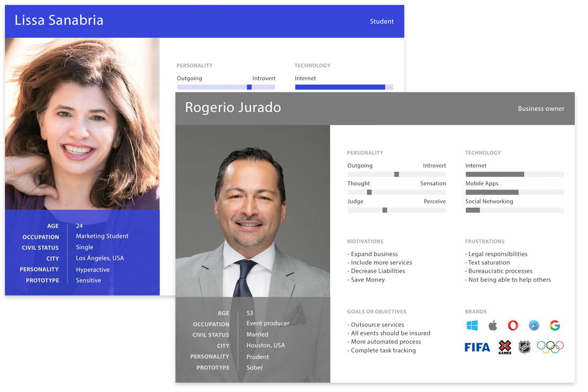
Deliverables: User flows, screen flows, information architecture, user personas, user stories.
Prototype
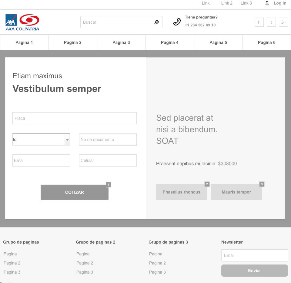
After validating the architecture, labeling and user flow. Sketches were made for each device (desktop, tablet and mobile) on paper, these sketches were validated with end users and business, after two iterations, wireframes were made, on them two iterations were made, they were tested on an interactive prototype by assigning tasks.
Deliverables: Sketches, wireframes, low-fidelity design, interactive prototypes.
Design
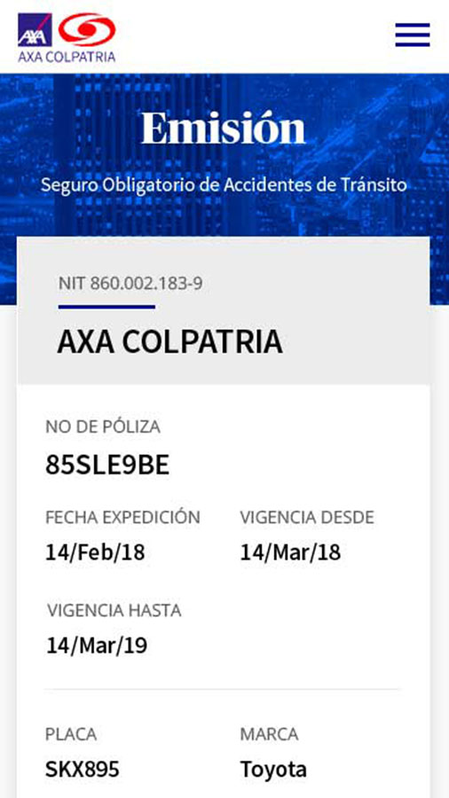
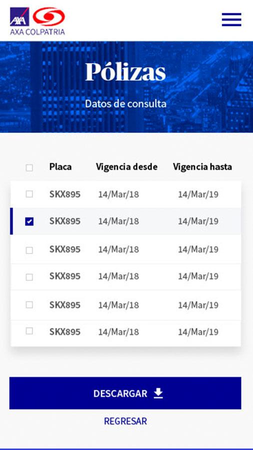
After the concept validation on wireframes, each of the platform components was designed consolidating the design system aligned with the brand guide and inspired by minimalism and material desgin. Based on this design system, high-fidelity designs for tablet, desktop and mobile were made, subsequently they were linked independently by device to be used in tests with users through interactive prototypes.
Deliverables: High-fidelity design, interactive prototypes, design system.
Test & Measure
Each of the steps in the entire process has been validated with end users and business with the objective of aligning the needs of each stakeholder. Users were tested with task flows, ten-second identification tests, accessibility tests on users with some type of disability. Likewise, heuristic tests were carried out by external entities that in this case were executed as auditors verifying each step of the design process.
Deliverables: Task flows results, heuristics, accessibility results, heatmaps, scrollmaps, clickmaps.
Results
31
Interviews
65
Usability Tests
11
Iterations
35
Artboards
Learnings
The biggest challenge was to make the business understand that more information may not necessarily be clear with the consumer, on the contrary, saturating users with excess text generates indesicion. This could be clarified thanks to user tests and the definition of a new flow of screens that were accompanied by changging the labeling and architecture of information in general. By conducting this user research and user profiling before starting to design aesthetic aspects or coding, reprocesses were avoided. The entity at the beggining was assuming rework as a normal part of the production cicle, with this new path, the number of iterations for adjustments was reduced by 63% with respect to the previous version. The inclusion of help messages and clean design, the online sales increased by 45% through this medium in less than three months after the publication of the latest version of the platform.
Due to the overcrowding of use, and over time, the behavior of users has been changing due to abandonments because of the permanent visibility of the navbar, this featurea has been adjusted to improve the performance of purchases and renovation.
The opportunity that this project gave me to work as a design and development team coordinator, allowed the company to reach new economic objectives in less time thanks to the early deliveries and the added value that the consumer now receives compared with the previous version and competitors. Nowadays, insurance and other projects of the same company have adopted the design thinking and scrum as agile transversal methodologies between development and design processes, because they could see the good performance and results of our way of working.


